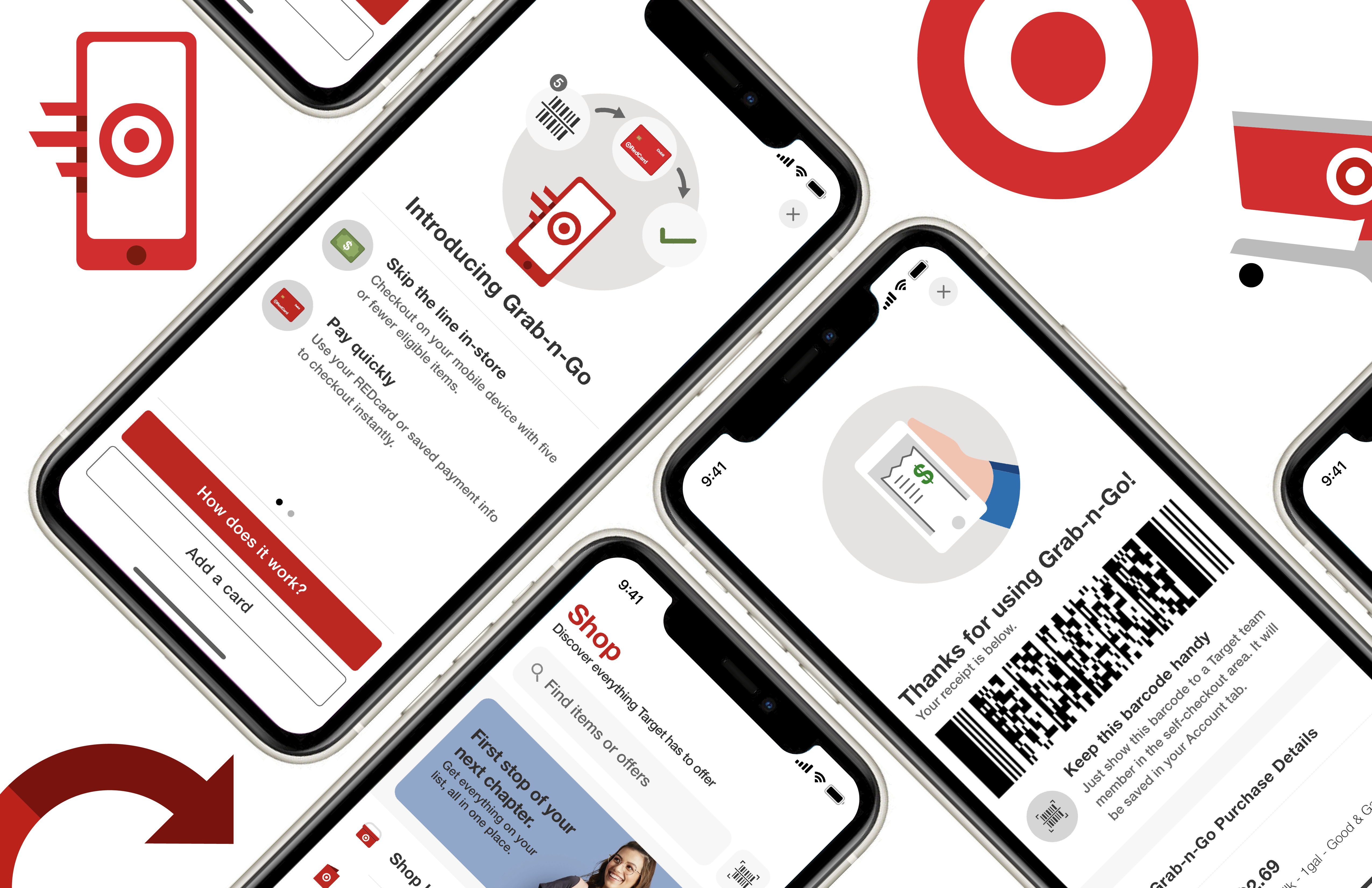
Core Experience: Checkout
One of the ways I investigated Target shoppers was by grouping them somewhere on the following spectrum:

Are they a hunter-type shopper or a gatherer-type shopper?
The concept is based on humanity's primitive subsistence lifestyle. This is not an entirely new way to view retail shoppers. It's been the subject of several studies and there are plenty of articles discussing it in further detail. The gist is this:
Hunter-Type Shoppers:
• Generally know what they are looking for.
• Use a direct, bee-line approach to accomplishing their goal.
• Have extra low tolerance for awkward user interaction.
Gatherer-Type Shoppers:
• Browse, look around, and shop leisurely.
• Heavily reliant upon visual cues like suggestions, imagery, and media.
• Are highly distractible and especially frustrated by unintuitive interaction.
Where Does Target's App Currently Stand?
Target's physical locations, in terms of brand identity, primarily aim to be gatherer-type establishments. Its consumer culture is known for their love of roaming through stores, discovering new "Target Finds". That philosophy works really well in-store. Products can be picked up and handled, even compared to one another. The Target app should use a similar philosophy of discovery, right?
Treating the app as a place to "discover" all-things Target is an approach that logically makes sense. However, assuming users operate the same way on mobile as they do in-store has caused confusion and frustration within the app. In my research, I found that users weren’t really using the app to actually "discover" new Target products. Social platforms (TikTok, Instagram, YouTube) allow customers a more personalized way to do that. Instead, Target shoppers are using the app as a tool to locate available inventory, check on available deals, and accumulate rewards (Hunter-type usage).
For this reason, an obvious addition would be to add more features that better integrate Hunter-style shopping. Since I also wanted to investigate the future of the checkout experience. This meant creating an alternative and daring checkout experience centered on shoppers rather than cashiers and checkout-kiosks.
The Target App and the Future of the Checkout Experience
Skills
UX Research & Design
Brand Identity Interaction
Digital Prototyping
Introduction
In February of 2021, I connected with a Target Fixture Design team leader via a mutual contact. Always eager to network, I asked for a Zoom conversation to get to know each other. Towards the end of our call, I asked them a simple question:
"What do you think is an important problem that needs investigation and would make for a nice addition to my portfolio?"
Their (abbreviated) recommendation was this:
"The future of the store checkout experience will be vital to Target's continued success; understanding the user's journey through checkout will be paramount."
I began thinking about what format this kind of project could take on every time I visited a Target store. After observing long lines during the pandemic, the expansion of the Target app's presence in checkout, as well as the futuristic store experiences that other companies like Amazon have produced, I became inspired to investigate and redesign the Target iOS app with a focus on the future of the checkout experience.
Below is a case study in which I prototype potential solutions to address some of the app's problems, as well as ideas for future development. My process was guided by numerous qualitative user research interviews as well as Target's brand guidelines.

Core Experience: Grab-n-Go Checkout
Grab-n-Go is a completely new experience in retail designed to bridge the gap between the current day self-checkout kiosks and the checkout process of the future (a la Amazon Go). It was born out of the understanding that users who are in a rush to grab just a few items are not going to be willing to wait in a long checkout line behind others completing their weekly haul. A better experience would be to put the checkout process in the hands of the customer. After years of online checkouts, self-checkout kiosks, and a pandemic-led online order uptick, I think consumers would readily embrace this new feature.
Below is a "How-To" screen that would show new users a quick description of how the process works.

Process Walkthrough
I chose to integrate existing features in the app in order to create this new process. After scanning items with the phone's camera, customers pay in-app with their saved payment cards. Then, as they leave the store, they simply scan their barcode receipt with a team member at the front of the store.

This feature was inspired by my user interviews where I learned just how different each user's experience could be Target. Because the company is so large, the way people view the company and use its apps and services is vastly different among different demographics and regions. After hearing how the hunter-type shoppers thought, I realized how catered to the gatherer type is at Target. This feature is meant to bridge that gap and make Target an easier and more efficient shopping experience for both types.
A couple weeks after I finished the mockup for this idea, I saw this kiosk in my local Target:

While this checkout option also uses a mobile device, it still requires a store employee's device to scan and oversee the process for you. Its use is dependent upon a free team member being able to assist at the kiosk. As you can see, there was not an employee present when I passed by. I felt that I was certainly on to something, and a little unoriginal considering we picked the same item limit...

Final Remarks and Next Steps
I really enjoyed taking this project on. I think there's so much more to be done to enhance the checkout experience and the app.
I'd love to pass the project around to some of my interview respondents and design colleagues to get their opinions and criticisms. I'd also love to do a bit more journey mapping of the way that users move through the in-store checkout process.
App-Focused Checkout Improvements
How is the App Currently Used in Checkout?
The most common use of the app in checkout is to either earn rewards by adding Target Circle offers to the user's account or checkout by using a saved payment method in the app. A pain point that came up several times in interviews was that it was difficult to remember where specific functions were located and that users felt anxious they were holding others up, especially in self-checkout. To counter that confusion, I moved the buttons to the top of the Account tab.
Research and Design Process
As a designer with experience in retail design (CVS Health and Luxury Brand Holdings), I'm passionate about store experiences. I think design plays a vital role in customer interaction; when it's working well, we don't even notice it's there.
However, I noticed something off-putting about the Target app. Billed as an all-in-one place to discover Target products, shop online, and place drive-up orders, the app has instead become a confusing criss-cross of new features, tabs, and shopping options.
To better understand the path the checkout experience is trending towards, I did some research about the Target app of the past. I also investigated Wal-Mart, Amazon, Costco, and Stop-and-Shop's online presence.

The 2017 version of the Target app looked a lot different. It was much more focused on in-store use and its layout and architecture reflect that. It wasn't until around June of 2020 that the app began to look similar to the app we see today. As they added new features like contactless shopping and drive up orders to increase flexibility during the pandemic, the app became cluttered little by little.

Design Approach
While Target's app stands out amongst its competitors, I still felt that it could be improved upon. I approached my redesign in three steps asking key questions along the way. I also conducted numerous user interviews throughout the process making certain that my design reflected user needs and habits.

2. Brand Adherence
What is Target's Brand Identity?
Target's brand identity, primarily characterized by their use of a semi-custom Helvetica Neue typeface, bold use of "Target" red on white, and the inclusion of playful elements such as 'Bullseye', Target's mascot. These elements are all included in the app and are generally applied really well.
More of an opportunity as opposed to a problem, there were a few areas that I thought branding could be pushed a bit farther.
Opportunities for Brand Insertion: Pre-Loader
To compensate for a more moderate and less-complex interface, I instead opted for the inclusion of custom branded details, like a new pre-loader in the shape of the Target logo as shown below.
Brand Identity and Interface
I consider the interface of an app inseparable from a brand's identity. A cluttered app filled with branded content is less powerful than a clean app with carefully placed brand imagery. For that reason, many of the interface changes were partially characterized by brand representation.

Opportunities for Brand Insertion: Existing Assets (Bullseye)
Target already has great branding across many communication channels and several assets to go along with it, like Bullseye the dog. I think any chance to add value by the inclusion of friendly brand messaging and imagery should be taken advantage of.

Scanner Confusion
Curiously, users were often tapping the 'Scanner' button in the search field, thinking they would be able to show their barcode that way. I added a "Show my barcode" option there for those users.


3. Visual Interface
Tab Improvements
As I mentioned previously, Target shoppers are much more likely to be using the app as a "hunter-type" tool to locate available inventory, check on available deals, and accumulate rewards.
For this reason, I found that one of the most glaring necessities was an overhaul of the tab architecture and interface. This ranged from simple changes, like the name of certain tabs, to the addition of new tabs like the 'Deals' tab, reprioritizing user needs.

'Shop' Tab Before and After
Modified for clearer use and features, I've removed "shopping method" and moved it to 'Cart' tab. I also the removed red background for more purposeful use of brand colors
'Cart' Tab Before and After
Left aligned header and subtotal at top offer better visual hierarchy
The cart tab was doing a lot right already, especially with items broken up by shopping method.
'Account' Tab (Formerly 'My Target' Tab) Before and After
The 'My Target' tab features were often confused with features located in 'Wallet'. For this reason, I combined them. The removal of the red background here as well helps give visual hierarchy to the important CTA's.

Search Bar Interface
As shown below, the search bar previously asked the user to choose whether to see items or Target Circle items before their search.
The search function now displays top results for both items and offers. Users can then select if they'd like to see all available results for either group. Items are displayed first when searching from the 'Shop' tab and offers are shown first when searching from the 'Deals' tab.

General Interface Improvements
While Target's branding is great throughout the app, interviewees noted that the use of red was overwhelming and distracted from important call-to-action (CTA) buttons. Further visual optimizations are demonstrated below.

New 'Deals' Tab (Formerly Within Discover) Before and After
Users' saved and recommended offers are given priority. The new 'Deals' tab removes confusion about where to find deals. The search bar and scanner icon are now also included.


